24LUMO
24LUMO — Website Design, Development & Bilingual Build
24LUMO is a specialist company for circadian-effective lighting and noise concepts in clinical and medical facilities. Their science-backed approach to non-pharmacological delirium management sits at the intersection of medicine, architecture and environmental design – a complex, highly specific topic that needed a website capable of communicating its depth with clarity, credibility and visual impact.
Role and scope
- Full UI/UX design and visual direction
- Webflow development and custom code implementation
- Custom animations and background motion design
- Bilingual build (German / English) with full translation integration
- Integration of photography, infographics and video content throughout
Objectives
- Translate a highly technical, medical subject into an accessible and compelling web experience
- Establish immediate credibility with clinical decision-makers, hospital managers and architects
- Create a visual language that feels scientific yet warm – precise but never cold
- Build a bilingual site (DE/EN) that works seamlessly across both languages
- Integrate rich media (photos, graphics, video) without sacrificing performance or readability
Audience
Hospital managers, clinical staff, architects and healthcare facility planners considering circadian lighting and noise reduction as part of patient care environments. They are informed, skeptical and time-poor – the site needs to earn trust quickly through clarity, depth and professional presentation.
Approach
The design starts from the subject matter itself: light and rhythm. The dark background with golden amber type mirrors the warmth of circadian light – an immediate, subconscious alignment between the visual language and the product. Custom background animations add a layer of movement that suggests the continuous, subtle shift of natural light throughout the day, without distracting from the scientific content. The page structure moves the visitor from problem (delirium, disrupted recovery) to solution (circadian lighting and noise management) to credibility (research, references, case evidence) to action, following the logic of how a hospital decision-maker would naturally evaluate a new concept.
Design highlights
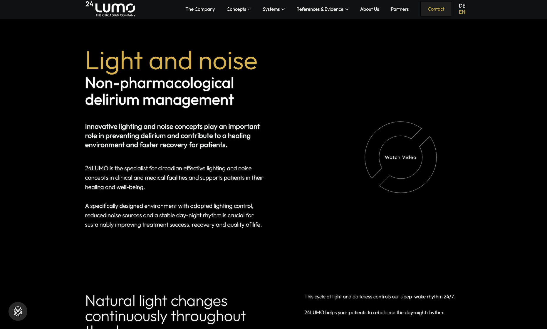
- Hero: Bold two-tone headline pairing "Light and noise" in amber with "Non-pharmacological delirium management" in white – immediately communicating both the product and the clinical context.
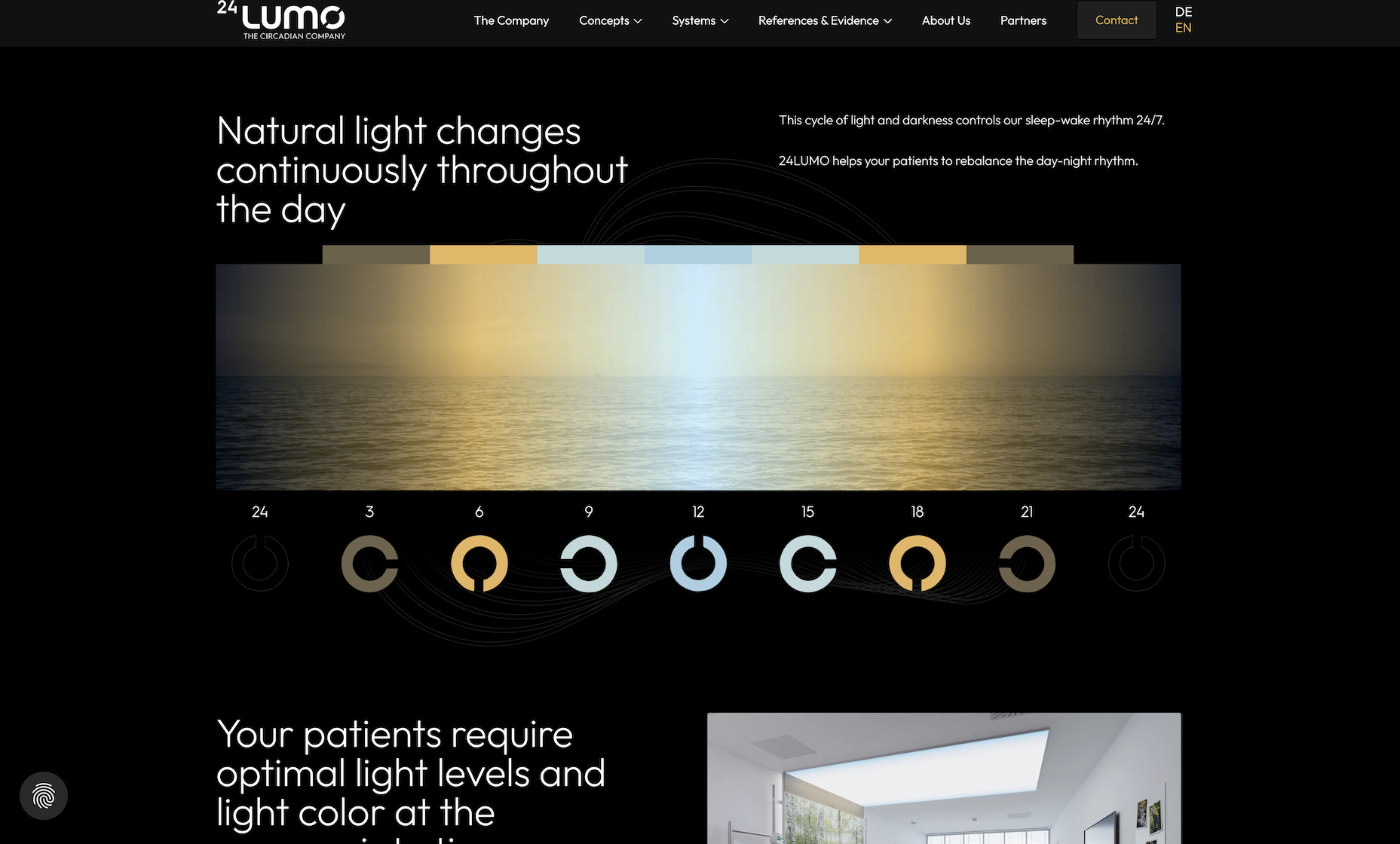
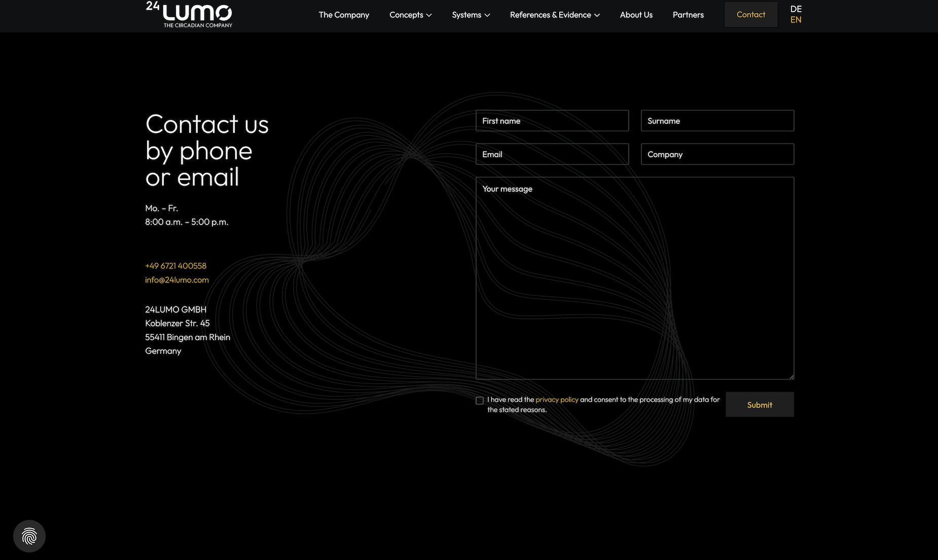
- Background animation: Custom-built ambient motion in the background that simulates the gradual transition of light throughout a 24-hour cycle, reinforcing the circadian concept without explicit explanation.
- Video integration: "Watch Video" CTA embedded cleanly into the hero section for visitors who want a quick overview before reading.
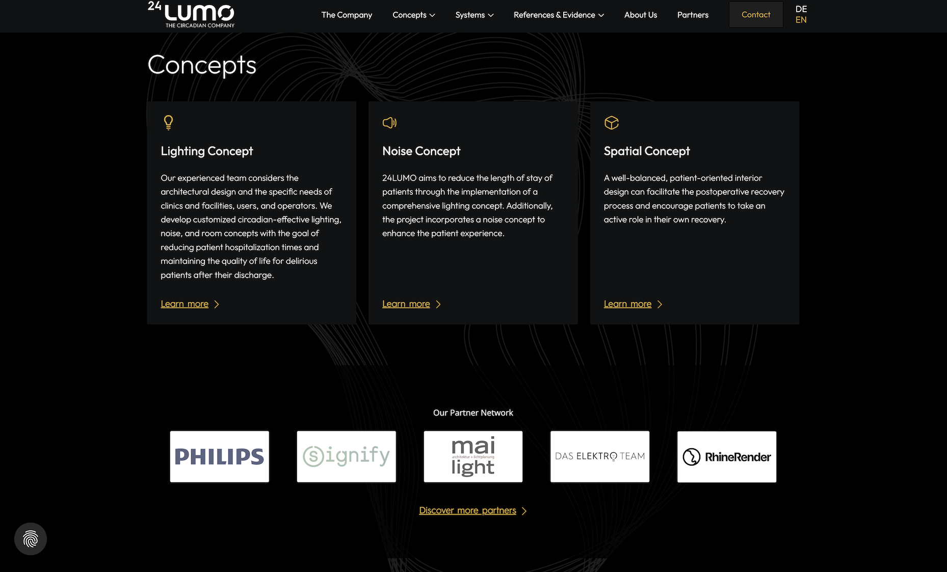
- Rich media sections: Photography, scientific infographics and illustrative graphics integrated throughout to break up dense content and make complex concepts tangible.
- Bilingual toggle: Clean DE/EN switcher in the navigation, with full content parity across both languages.
Visual language
- Type: Large, expressive headlines in amber gold paired with clean white body copy on near-black – scientific precision meets warmth and approachability.
- Color: Dark base with a signature amber/gold accent drawn directly from the concept of circadian light – warm, purposeful and distinctive in a sector dominated by clinical blues and whites.
- Imagery: Clinical photography, abstract light graphics and scientific diagrams used in combination to speak to both the emotional and rational dimensions of the product.
Interactions and custom code
The standout technical element is the custom background animation that runs continuously throughout the site – a subtle, ambient motion layer that communicates the core concept of circadian rhythm without a single word of explanation. Additional scroll-triggered animations bring content sections and data visuals in smoothly as the user scrolls, maintaining engagement across what is otherwise a content-heavy, research-backed page. The bilingual build required careful Webflow structure to ensure full content independence between DE and EN without duplicating layout work.
Accessibility and performance
- Video content lazy-loaded and embedded cleanly to avoid blocking page render.
- All animations respect reduced-motion preferences.
- Bilingual structure built to be maintainable and expandable as content grows.
- Strong color contrast between amber text and dark background maintained throughout.
Services delivered
Full website design and development, custom background animation, scroll-triggered interactions, custom code implementation, bilingual DE/EN build and translation integration, photo and video integration, infographic layout.
Tools
Figma for design and layout, Webflow for development, JavaScript and custom CSS for animations and interactions.
More Cases